Lines Cutting A Plane
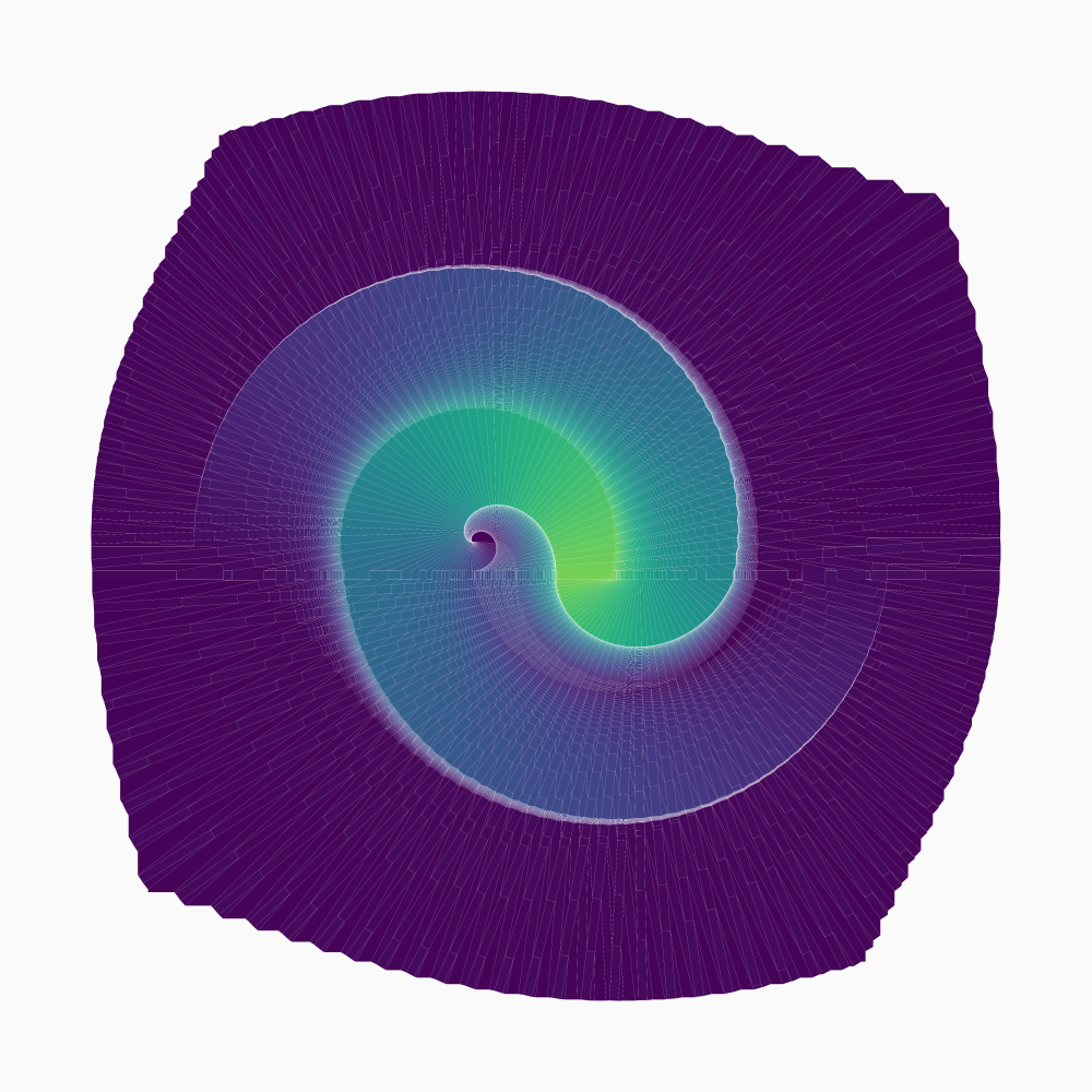
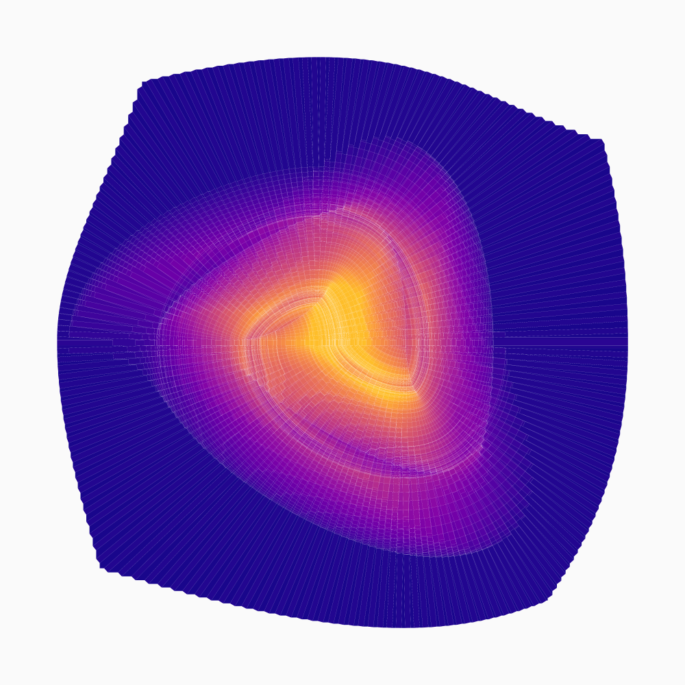
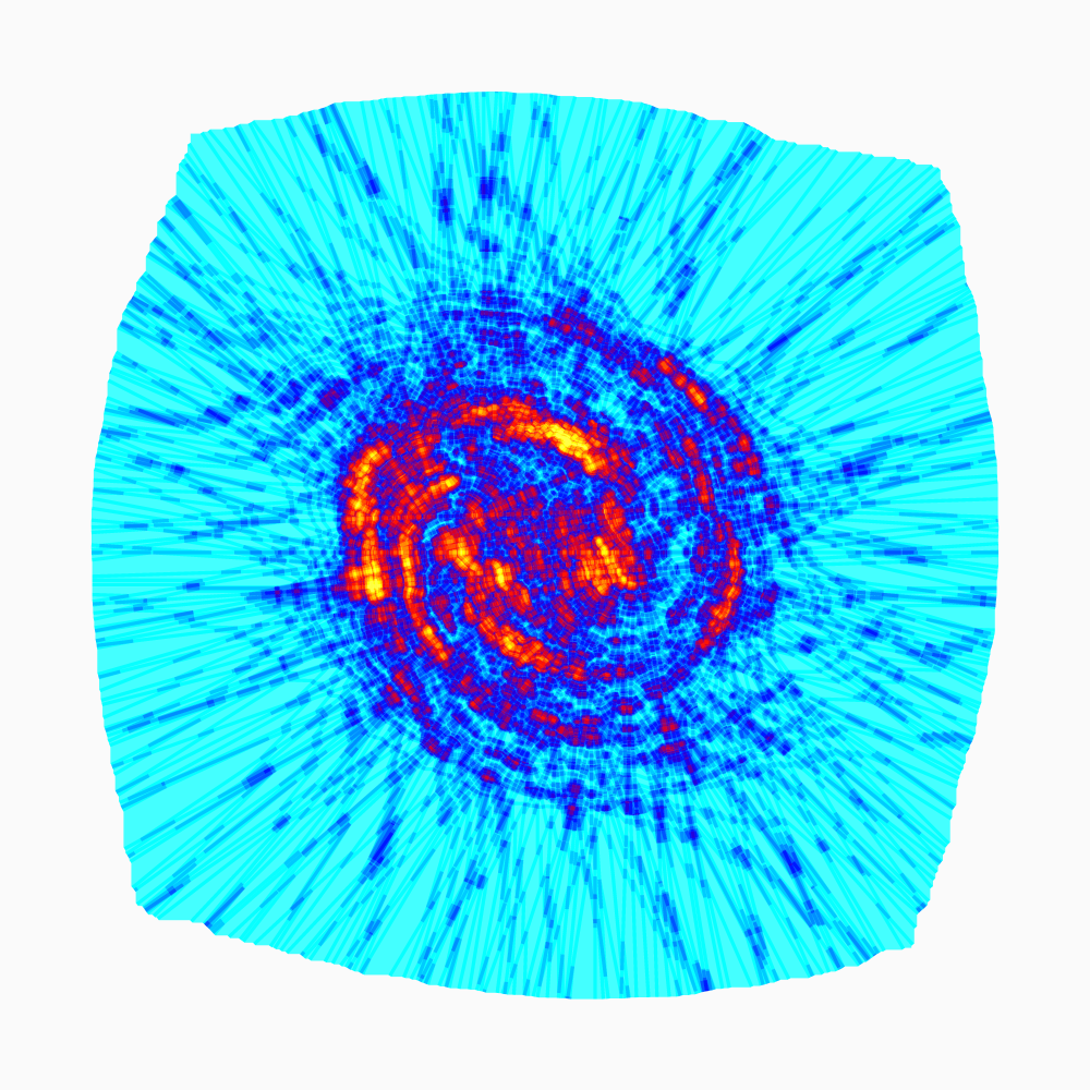
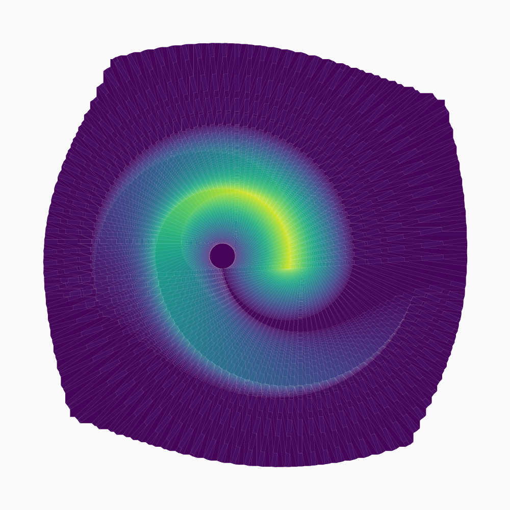
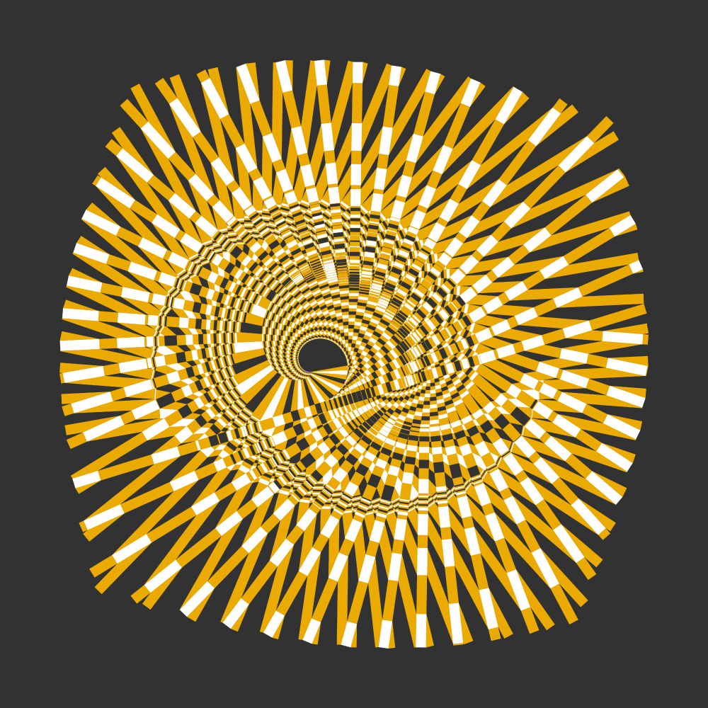
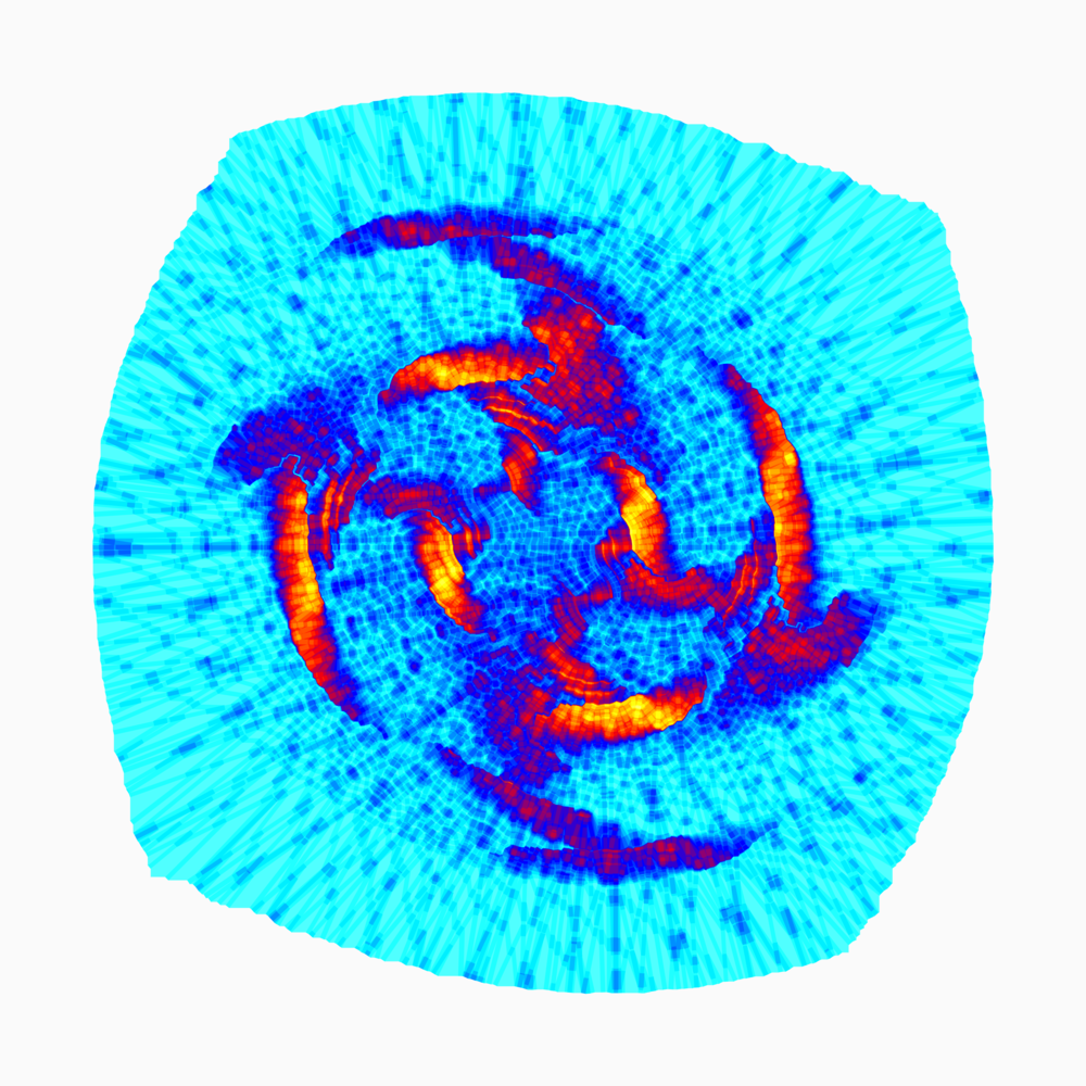
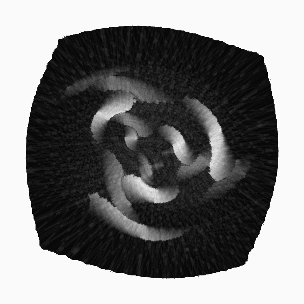
Same idea as this gif (and alternatively this). Each line splits the plane and pushes everything sideways a little. Unlike the original, everything here is perfectly straight and polygonal. Colors are roughly based on how many times a region has been cut through.
(Please excuse my taste in colors; better ones exist, but they weren't as convenient to use.)
The ones below are draw slightly different. Polygon borders are drawn with exaggerated stroke widths, resulting a jagged texture.
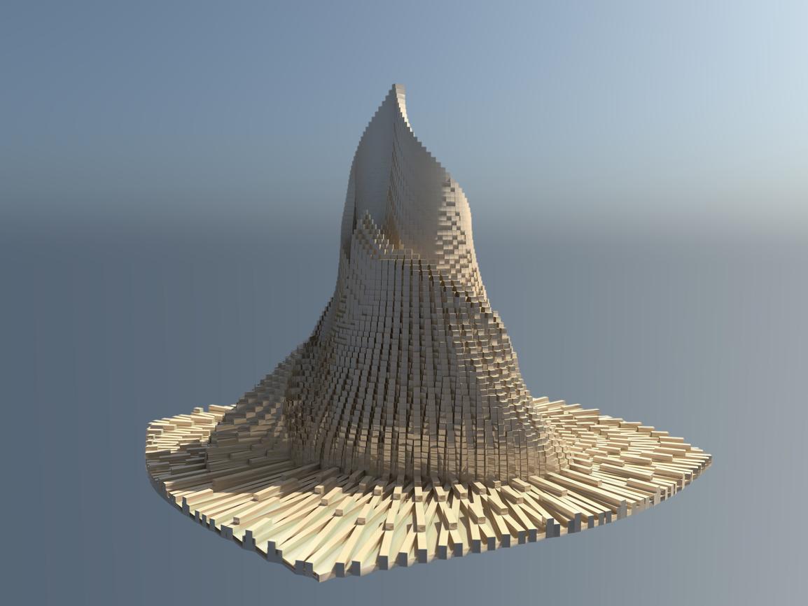
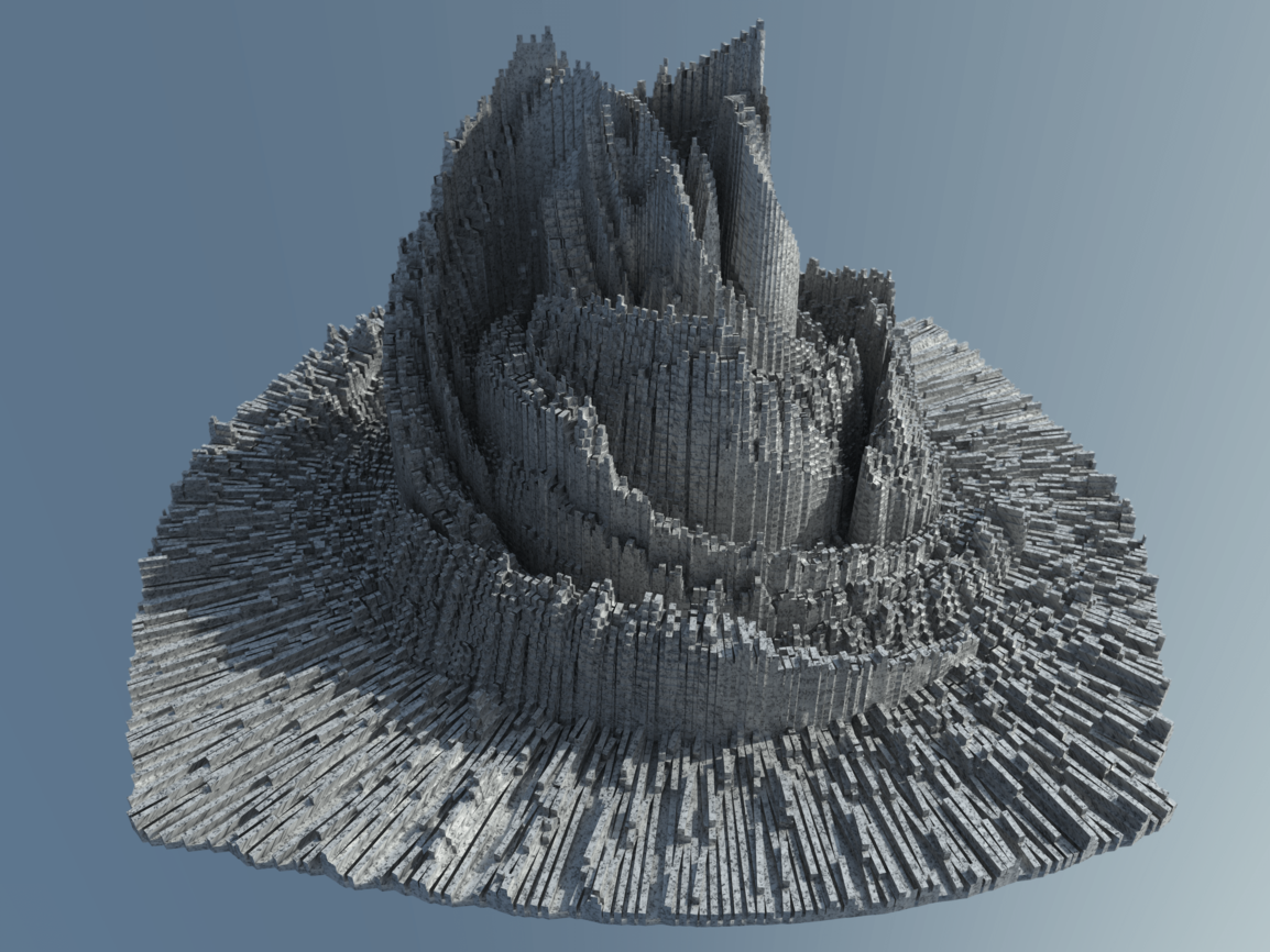
3D Renderings
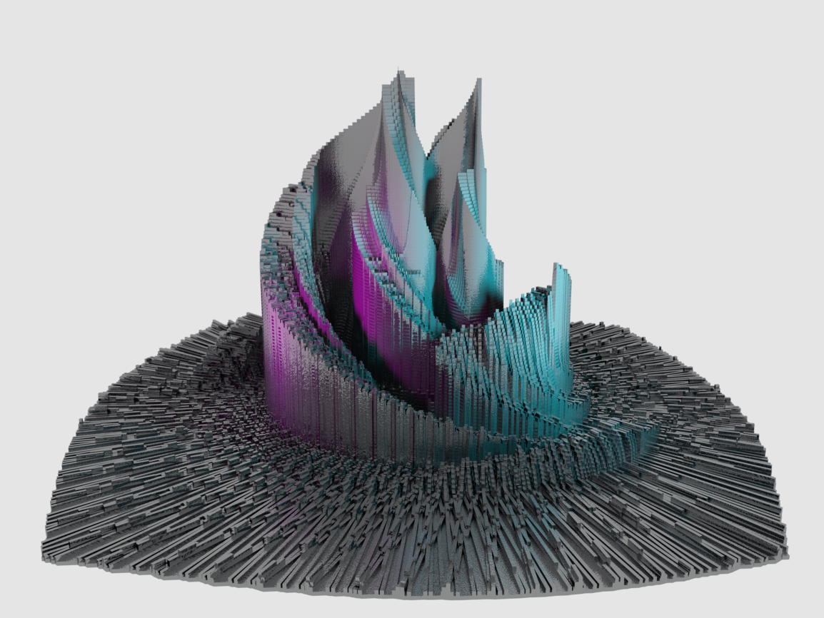
The same information can also be made into a 3D mesh and nicely rendered. All of these have a futuristic-cityscape-ish look to them. Height at each point, like color, corresponds to the frequency of cuts around it. The first is rendered with with Adobe Dimension, and the rest with Artlantis.
